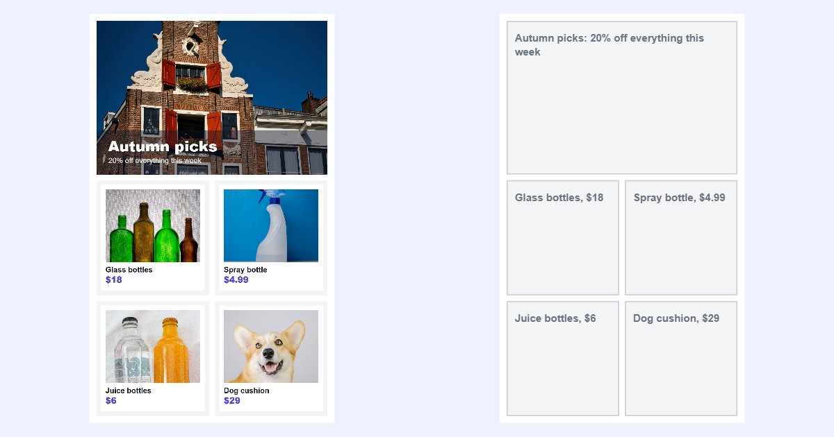
Designing a whole email as one picture is tempting. It looks exactly the way you designed it, in every email app, and you don't need to fight with email HTML. Slice it into pieces, add a link to each, and you're done.
But an email made only of images has real costs, and some of your readers will never see the design at all. This guide looks honestly at the trade-offs, so you can decide part by part what should be an image and what should be real text.
Three ways to build an email
- One big image. The whole design as a single picture. Simple, but the whole email has one link, and if the image doesn't load, the email is empty.
- Sliced images. The design cut into blocks, each its own image with its own link. This is what the email image splitter is for. See how to split a long email design into image blocks.
- Live text with images. Headlines, body text and buttons are real text in your email builder; pictures are used for photos, products and graphics.
Most good emails are a mix of the last two.
The costs of image-only emails
Some email apps don't show images straight away
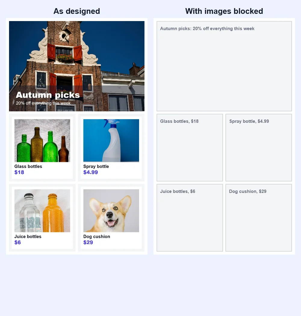
Microsoft's support page for classic Outlook says it plainly: "Microsoft Outlook is configured by default to block automatic picture downloads from the Internet." Readers have to click to download the pictures. Until they do, an image-only email shows nothing but empty boxes, and the reader may delete it before ever seeing your offer.
Screen readers can only read what you write for them
People who use screen readers hear your email instead of seeing it. A picture of a headline is silent unless you give it a text description. The W3C's accessibility guidance starts with exactly this rule: "Images must have text alternatives that describe the information or function represented by them."
In an email builder, that text alternative is the alt text of each image block. It's also what shows in the grey boxes when images are blocked.
Spam filters look at content and images
Mailchimp's guide About Spam Filters says that "some Internet Service Providers (ISPs) may have more aggressive spam filters that flag emails based on specific content or images", and recommends that email content be "clear, clean, and balanced". There's no fixed rule for how many images are too many, but an email that is nothing but pictures isn't balanced. Mailchimp suggests A/B testing to see how changes affect delivery.
Images are slower to change
A typo in live text is fixed in seconds. A typo in a picture means going back to the design tool, exporting and slicing again. Prices, dates and names change often, so they're the riskiest things to put in an image.
When slicing makes sense
Slicing is still the right choice for parts of an email where the design is the message:
- Hero banners with a photo and a short headline that must look exactly right.
- Product photos and collages, where each product links to its own page.
- Designed sections that are hard to build in your email builder, like a layout with text over a photo.
- Quick, one-off campaigns where the design is ready and speed matters more than flexibility.
For these, slicing beats one big image: each piece can link somewhere different, and smaller pieces start showing sooner. The email image sizes article covers the right width and file size for each piece.
When live text is better
- The main message. If someone reads only the text, they should still understand what you're offering.
- Body text and long paragraphs. Text in images doesn't wrap on phones and can become tiny.
- Buttons and calls to action. A real button works even when images are blocked.
- Prices, dates, codes and legal text. They change, people may want to copy them, and they must be readable.
- The footer: address, unsubscribe link and contact details.
A mixed approach that works
- Build the email's structure in your email builder, with real text for headlines, body and buttons.
- Design the visual parts (hero, product grid, special sections) as images.
- Slice those images in the email image splitter, so each piece is the right size and links to the right place.
- Give every image block alt text that says what the image shows or does, for example "Spring sale: 30% off all plants".
- Send a test with images turned off, and read it. If the message still makes sense, you're done.
Checklist
- The main message is in live text, not only in an image.
- Every image has alt text that would make sense on its own.
- Buttons are real buttons, not pictures of buttons.
- Prices, dates and codes are text.
- Each sliced block links to the right page.
- The email still makes sense with images turned off.
- You've sent yourself a test and read it on a phone.
Questions
Is it wrong to send an image-only email? Not wrong, but risky. Some readers won't see the images straight away, screen reader users only get the alt text, and some spam filters are stricter with image-heavy emails. Keeping the key message in text avoids all three problems.
Does slicing make the email load faster? The total size stays about the same, but readers see the first pieces sooner, and each piece can have its own link. Choosing JPG for photos and PNG for text-heavy pieces helps too.
Do you upload my email design? No. The splitter works in your browser; the design stays on your device.